BEHIND THE DESIGN
As a graphic designer, I strive to create impactful graphics that stand out and are aligned with the client's vision. My portfolio covers a variety of projects including logos, digital illustrations, and product designs.
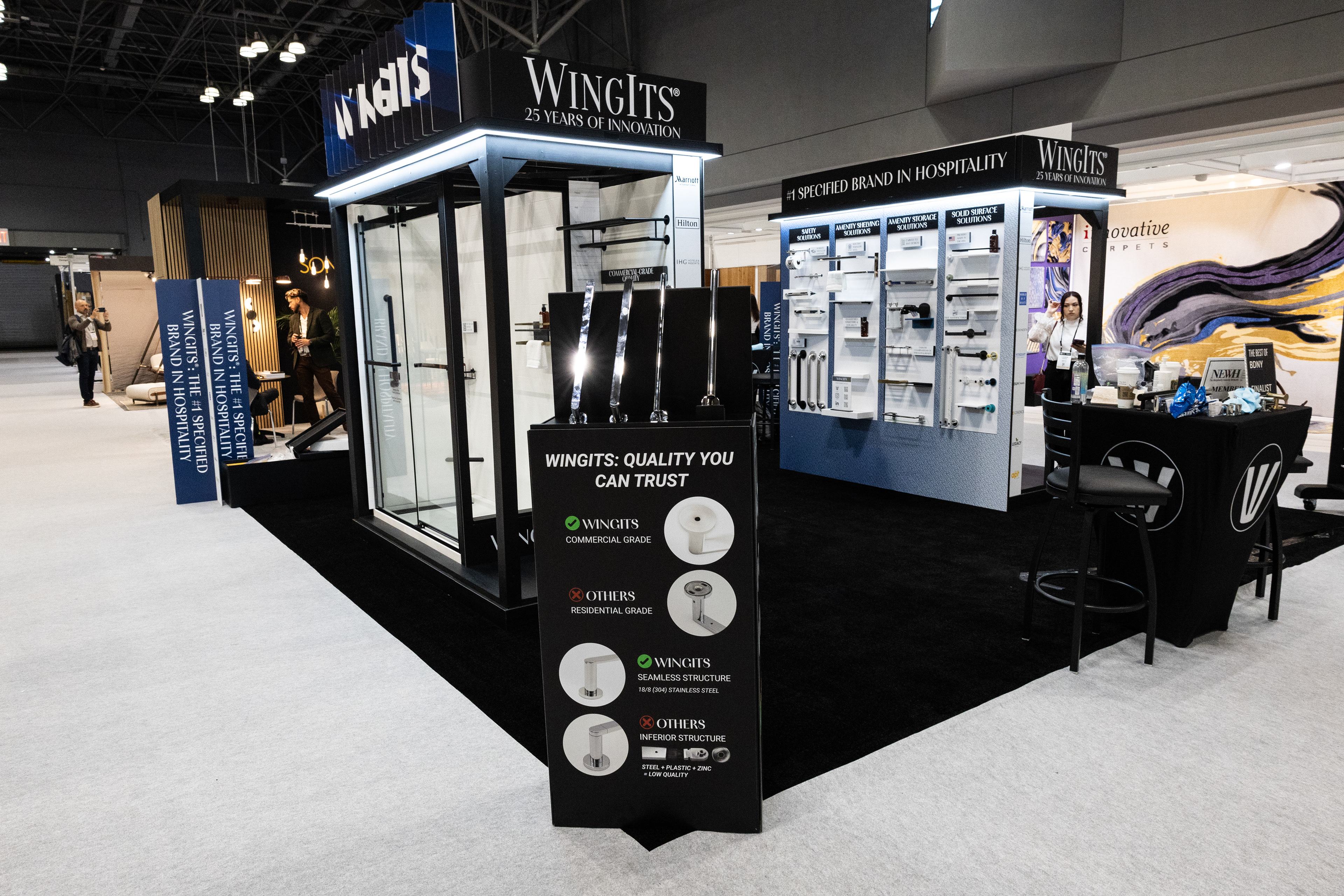
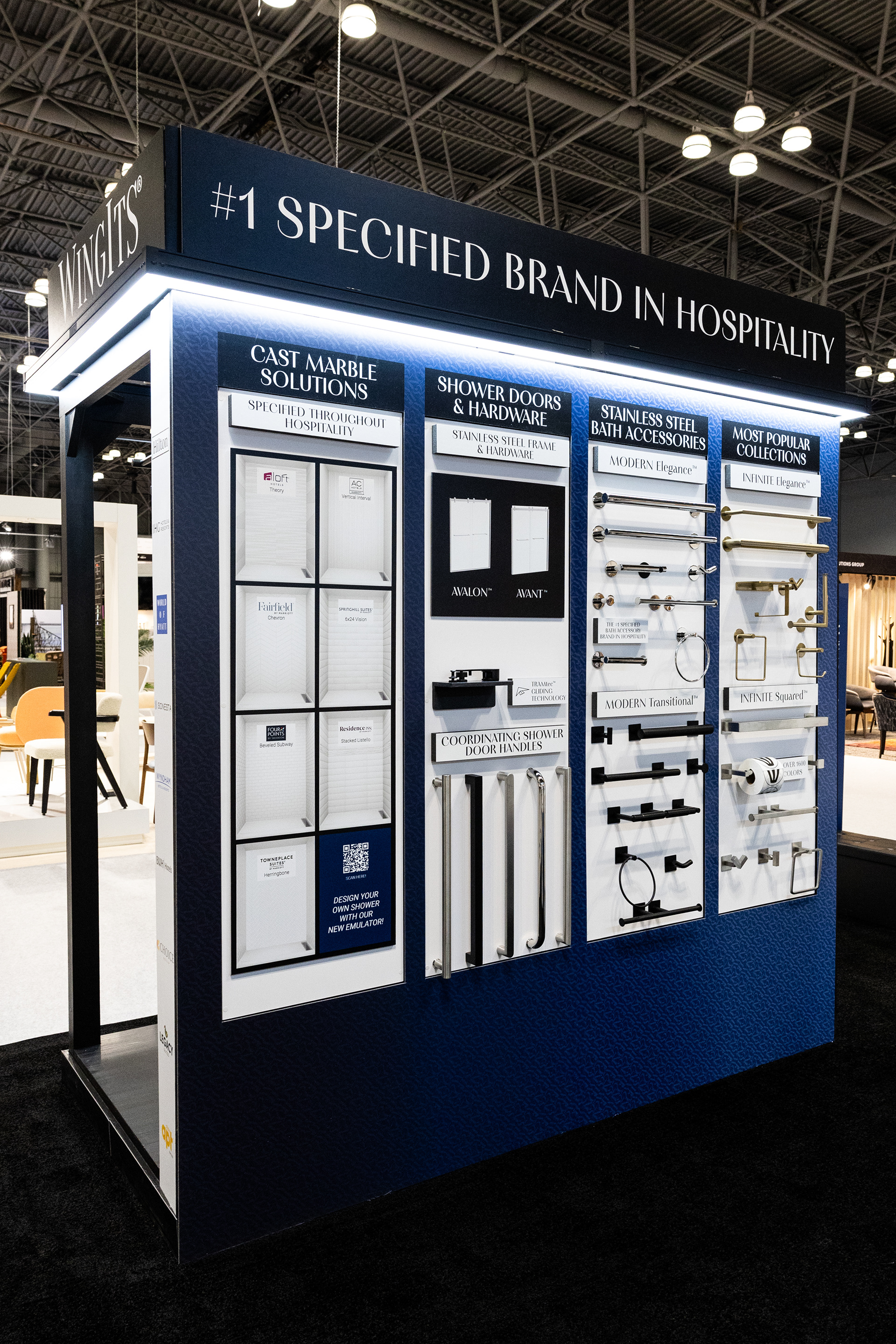
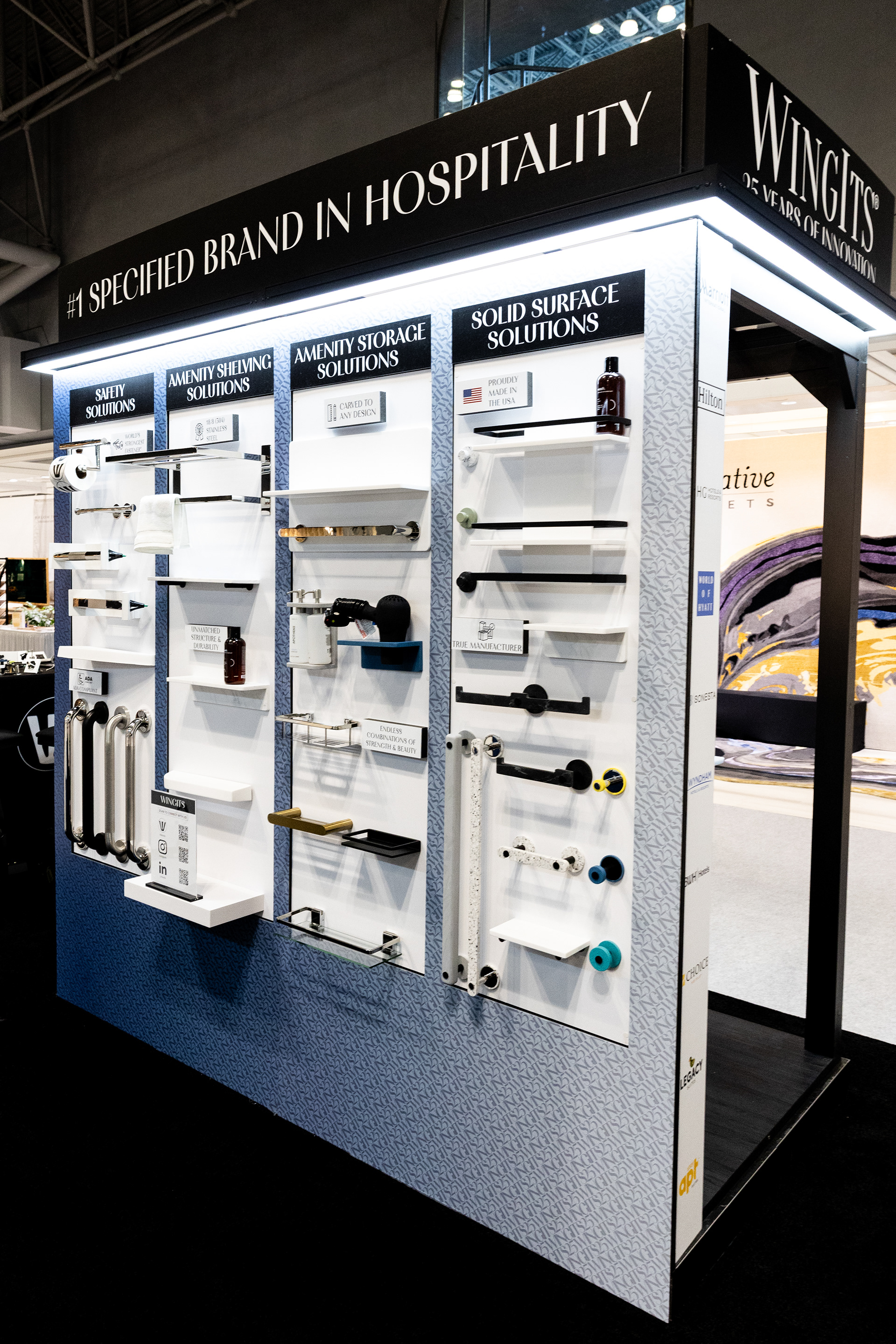
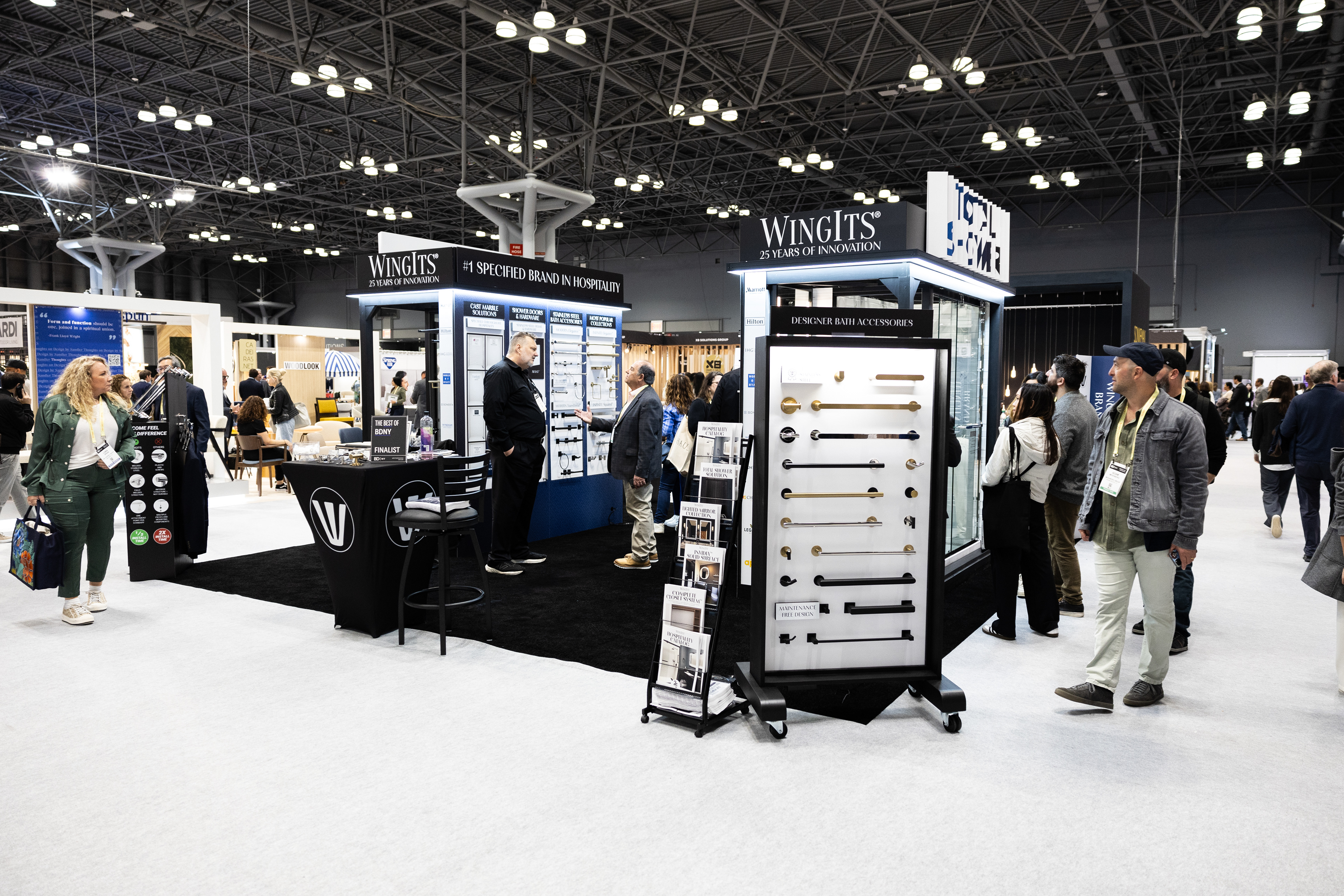

I have designed and collaborated on many trade show displays. Shown above are the most recent BDNY trade show displays I worked on at the Javits Center in New York City.


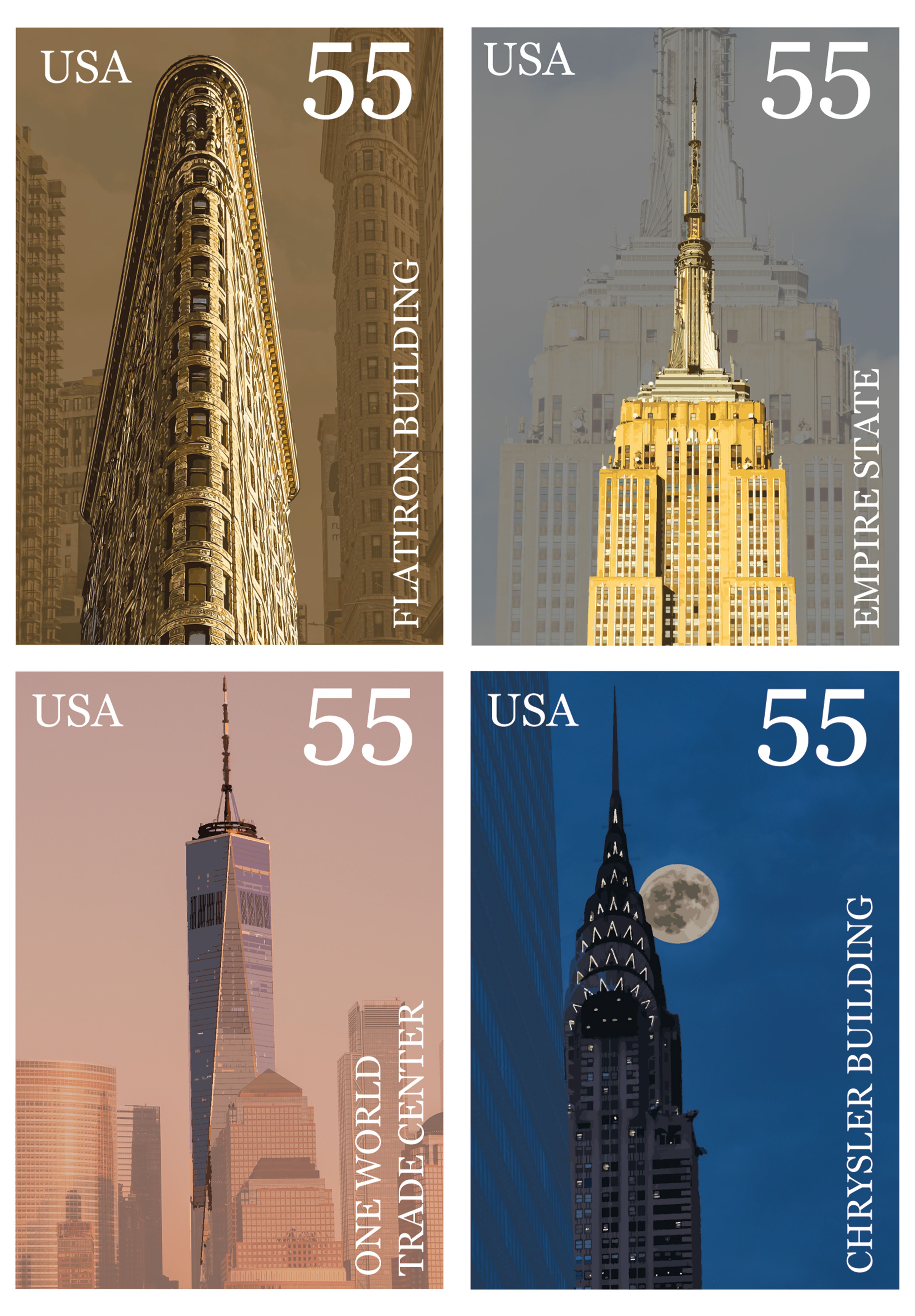
The idea of the stamp project was to create a series of stamps for the United States Postal Service using Adobe Photoshop. The theme I chose was to highlight New York City's famous buildings and include the back story behind each of them. All of the photographs used in this project are my own original photography.
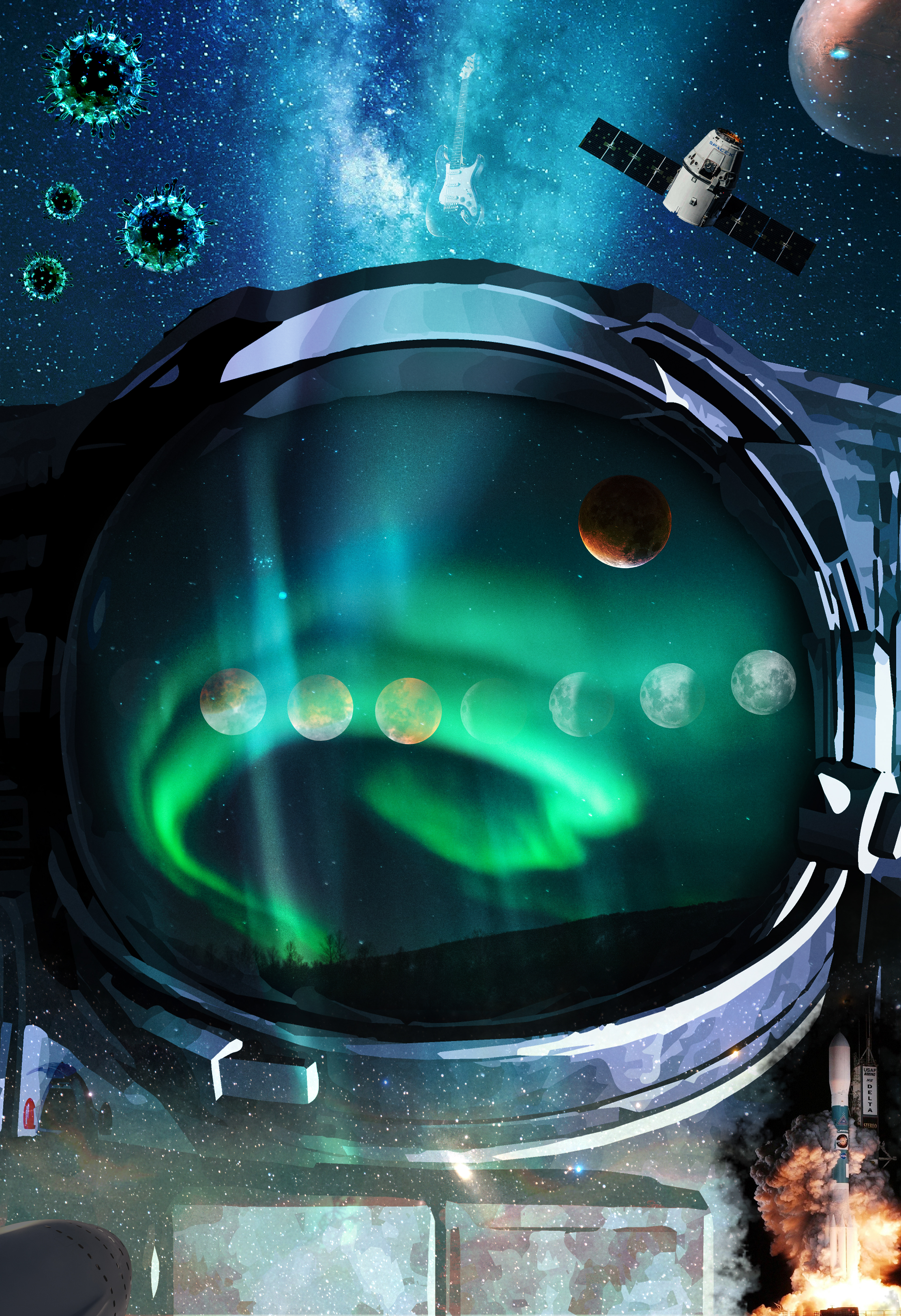
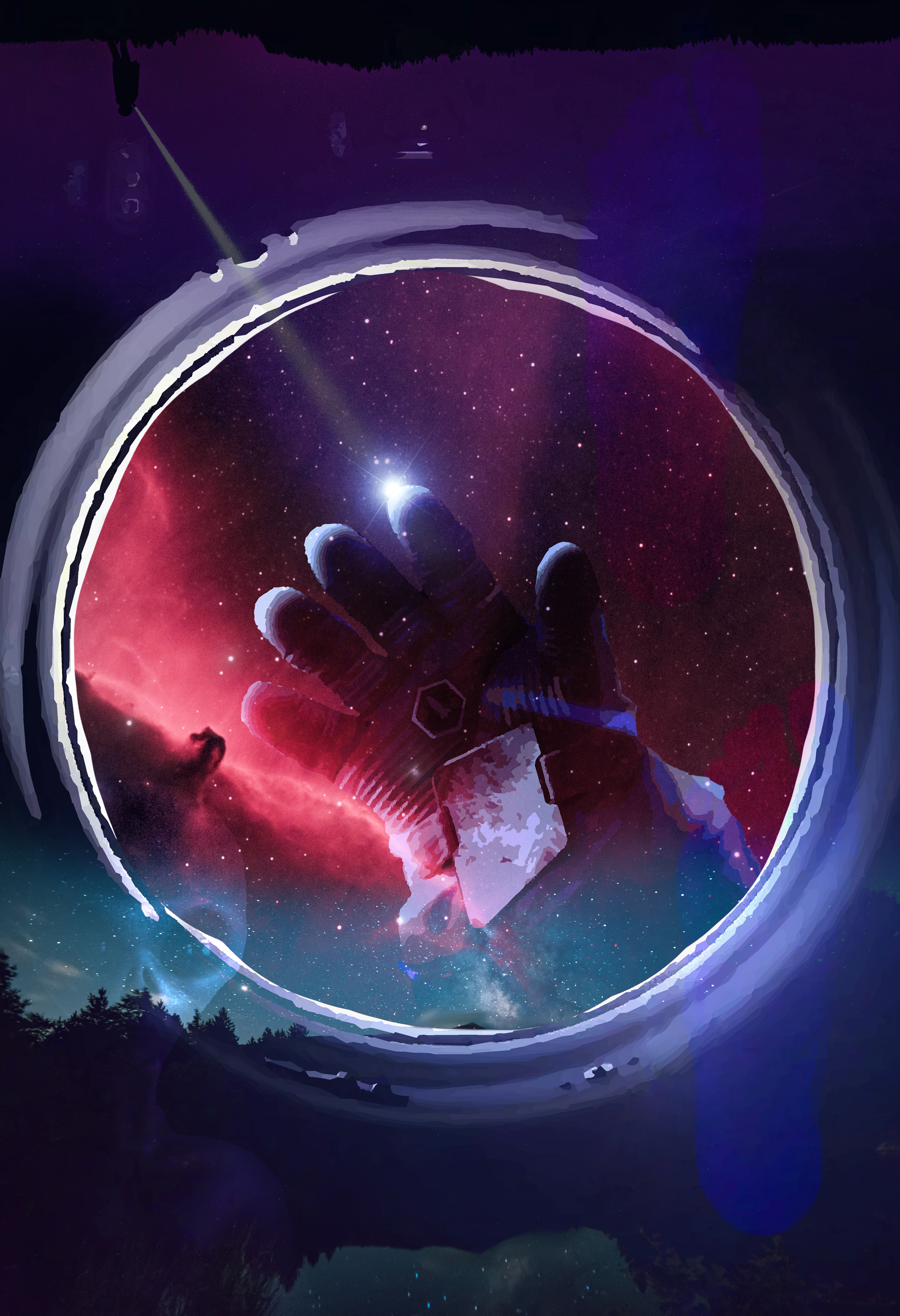
The two digital collages shown above explore how art and science can work together. I chose the theme of space exploration. One collage shows the perspective of the astronaut looking out, and the other from the perspective looking inside at the astronaut. This project sharpened my Photoshop skills as well as composition. I also explored opposites such as inside and outside perspectives and spaces.
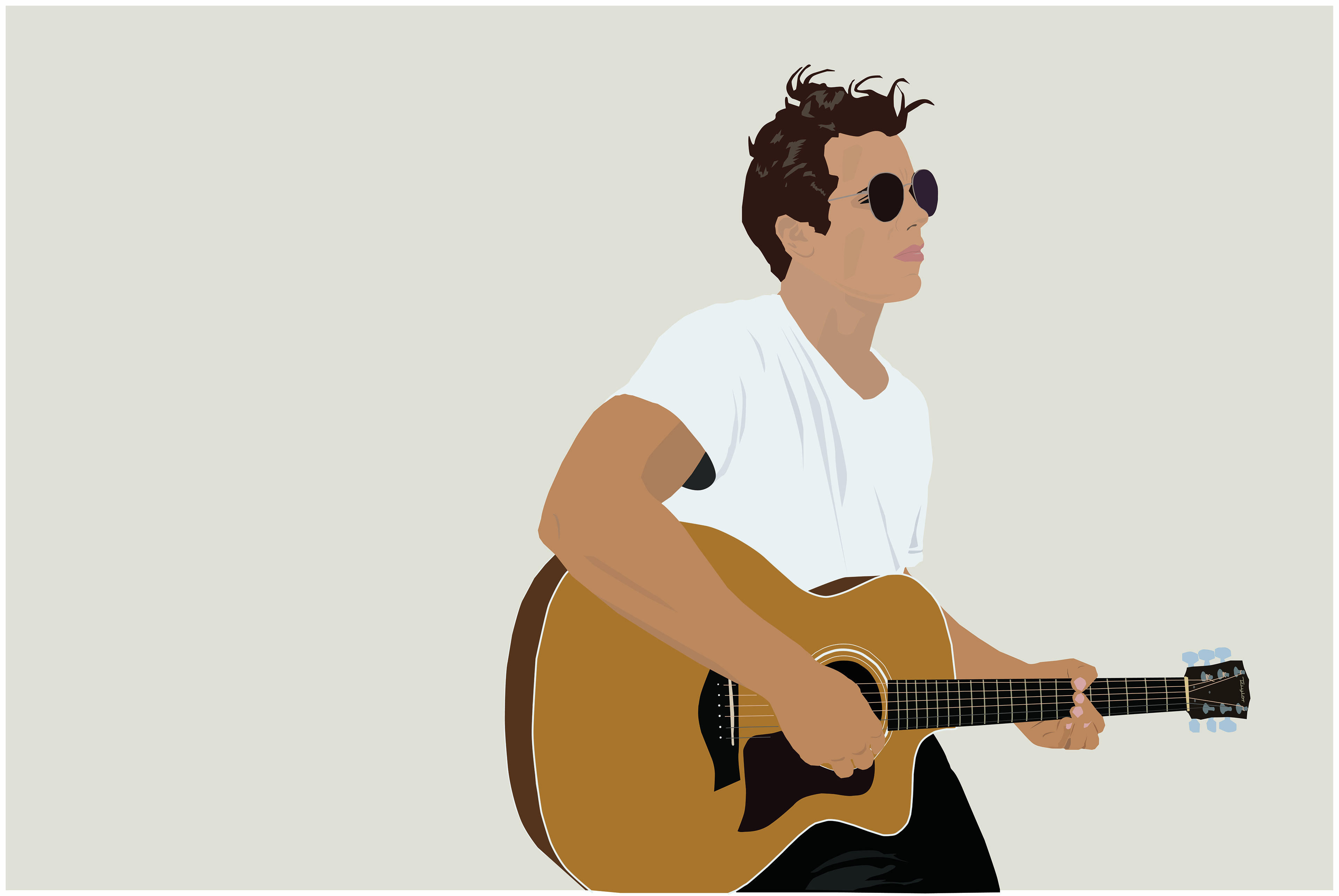
I chose to create a digital illustration based off a photo of myself playing guitar. I wanted to create a piece with enough detail without overdoing it. I chose a very stark background because I wanted to have the illustration pop out.
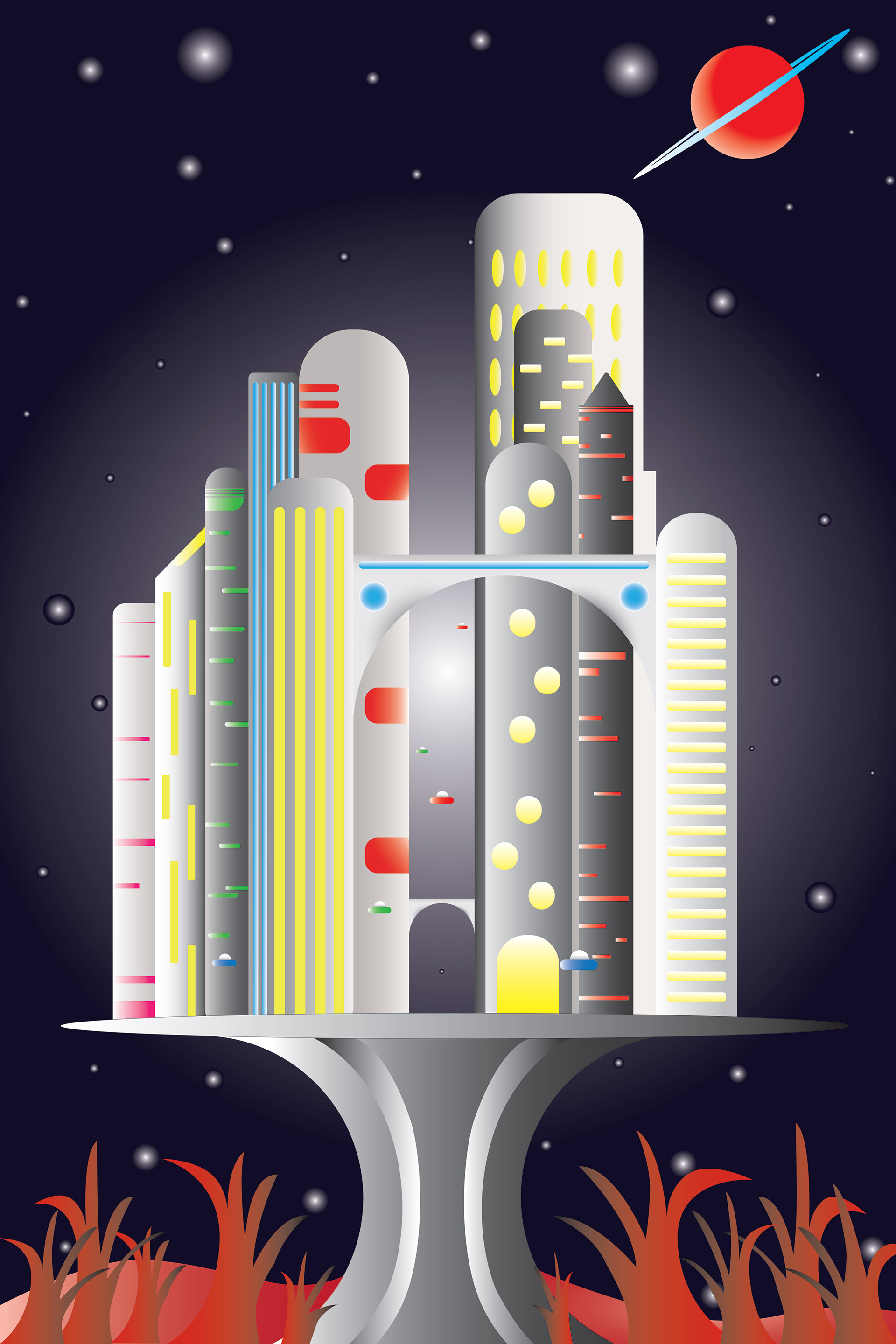
This was a project that was done in a digital illustration class. The purpose of the project wad to exercise working with vector shapes in Adobe Illustrator. The idea was to create an image based on a tree house design. My final concept was derived from my love for modern architecture and science fiction films. I went for a clean design for the buildings which didn’t have too much detial, but was also pleasing to the eye.
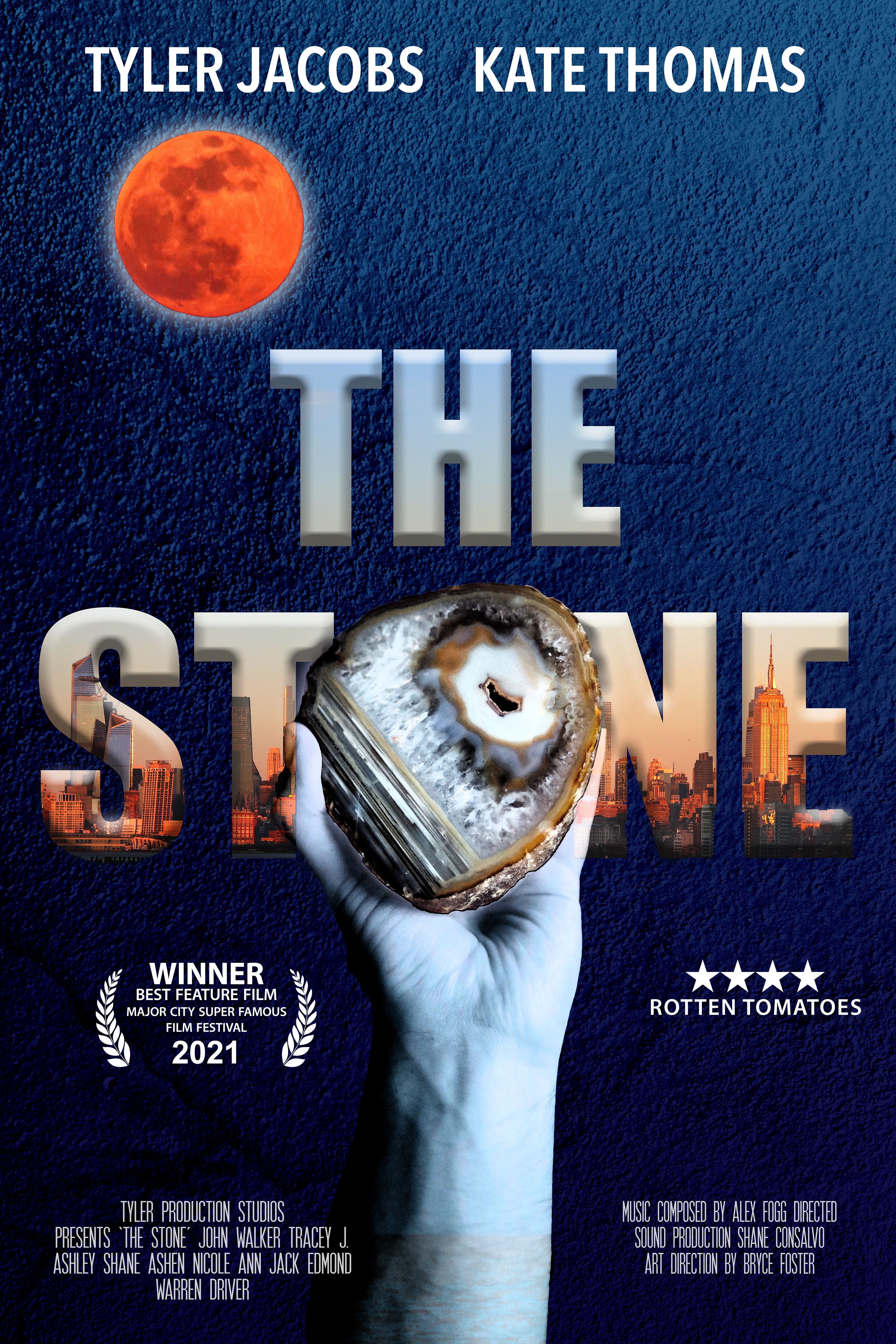
I was given random key words that described the location, descriptive adjectives, characters, genre, and time period of a fictional movie. I used those key words to write a movie synopsis and designed the poster for the film called “The Stone”. The symbolism of the stone and the fist represent the desire of finding the stone and also the greed of wanting possesion of power. I used my original photographs in this piece.
In this project, students had to choose a topic and theme and create a set of currency.
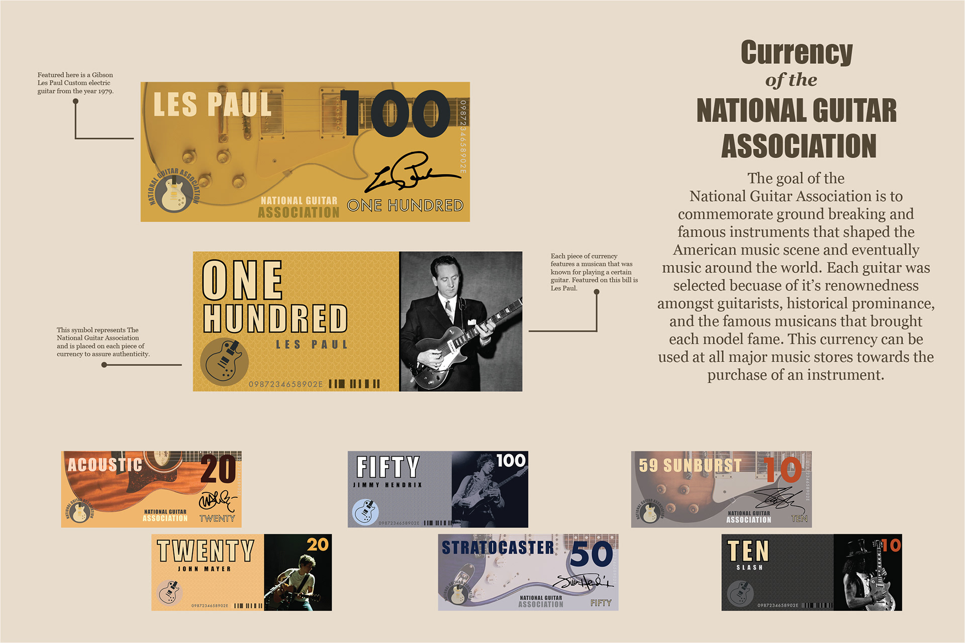
This project was to explore typography skills and the use of Adobe Illustrator and InDesign. I chose the theme of famous guitar models paired with a notable artist famous for using them. The reason I chose guitars and these specific artists is that music is a huge part of my life and as a guitarist myself, I wanted to choose a theme that resonated with my life.
This project was to explore typography skills and the use of Adobe Illustrator and InDesign. I chose the theme of famous guitar models paired with a notable artist famous for using them. The reason I chose guitars and these specific artists is that music is a huge part of my life and as a guitarist myself, I wanted to choose a theme that resonated with my life.
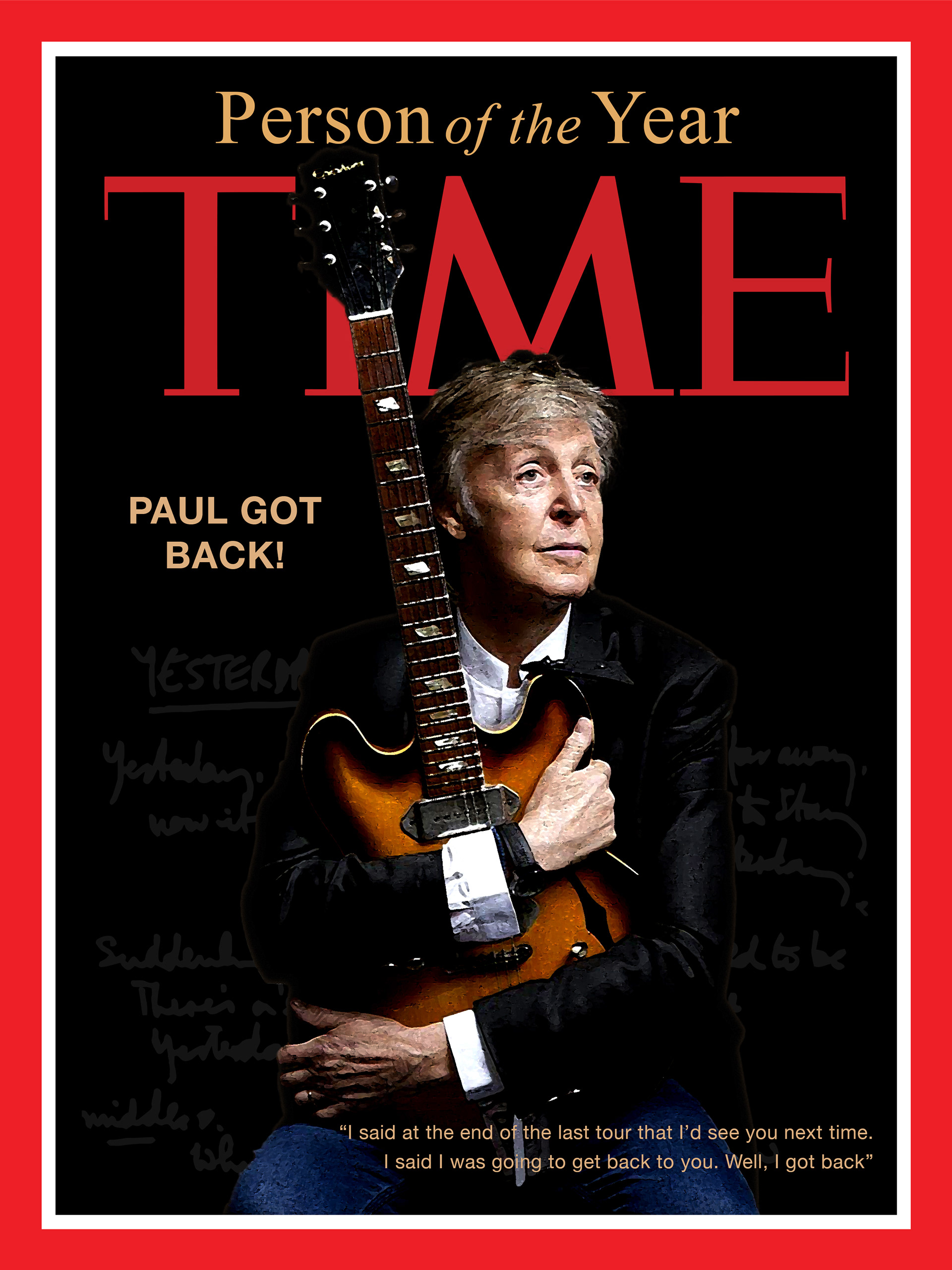
The concept for this project was to choose a celebrity and make them Time Magazine’s Person of the Year. The objectve was to create two different covers. One cover being a traditional photograph and the other more creative in filtering and effects. I chose Paul McCartney becuase he is a big influence to my life creativley and I am also a big fan of his music. The cover shown is the traditional version which I also incorporated Paul’s hand written lyrics to the Beatles song “Yesturday”.
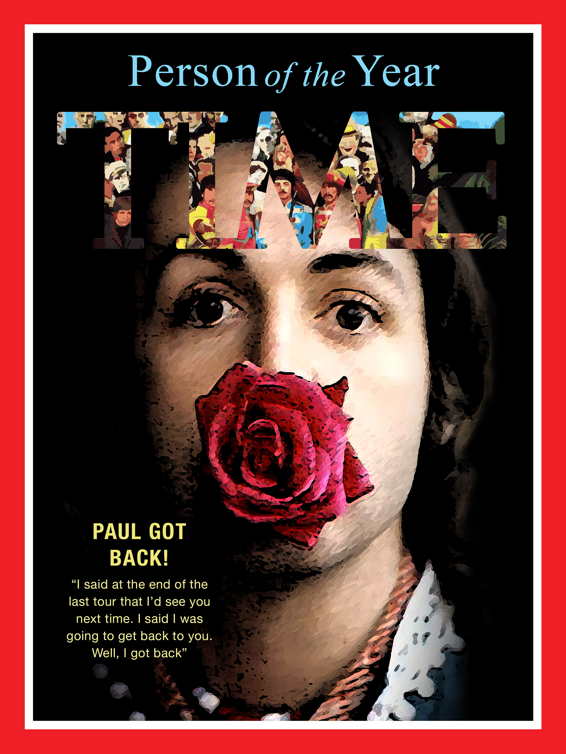
For the second cover, I decided to use a vintage photo of Paul with a rose which I found unique. I applied texture filers to the rose and Paul’s face. For the type, I placed the Beatles album Sgt. Pepper's Lonely Hearts Club Band into the title text. I sampled the blue and yellow from the album art as well.
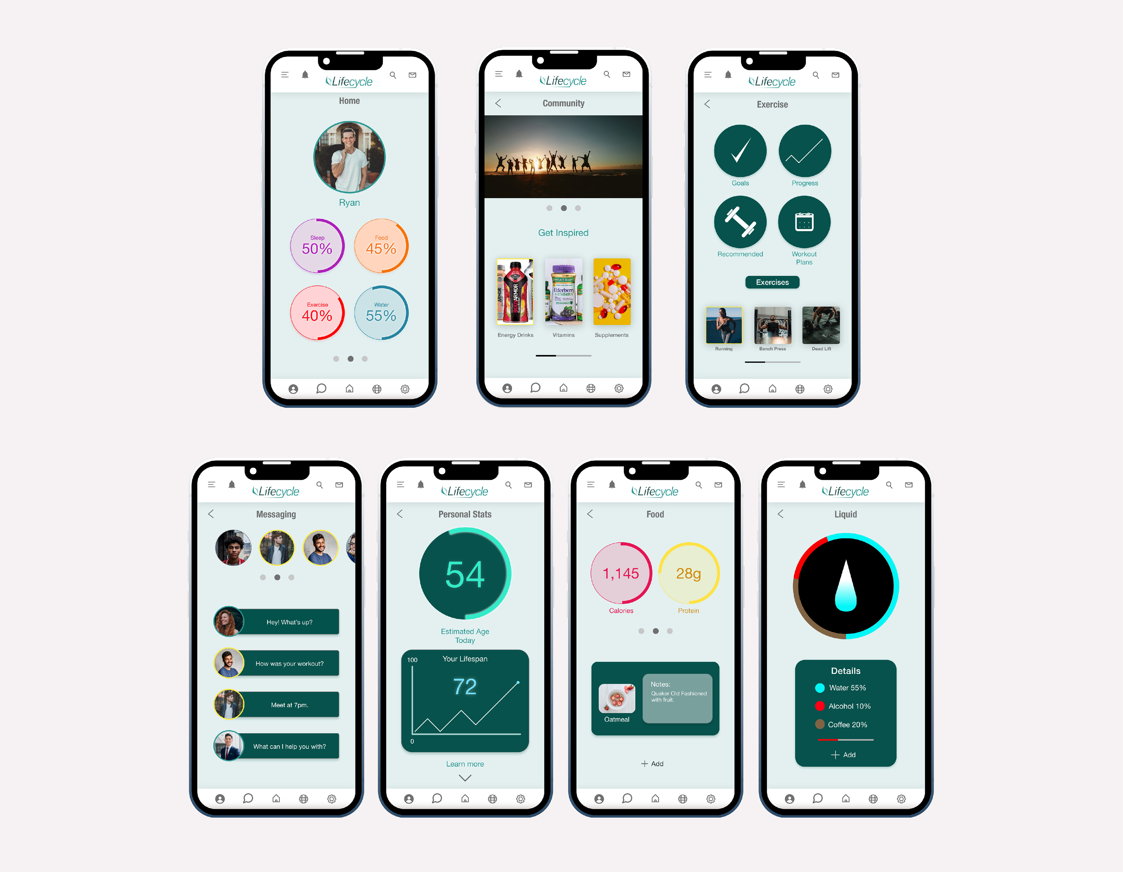

The Lifecycle App is more than a standard fitness application. The app combines everything from tracking calories to planning workouts to help the user achieve a better level of health.

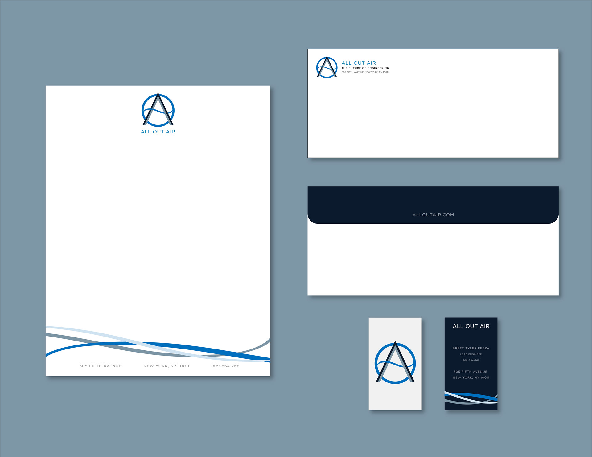

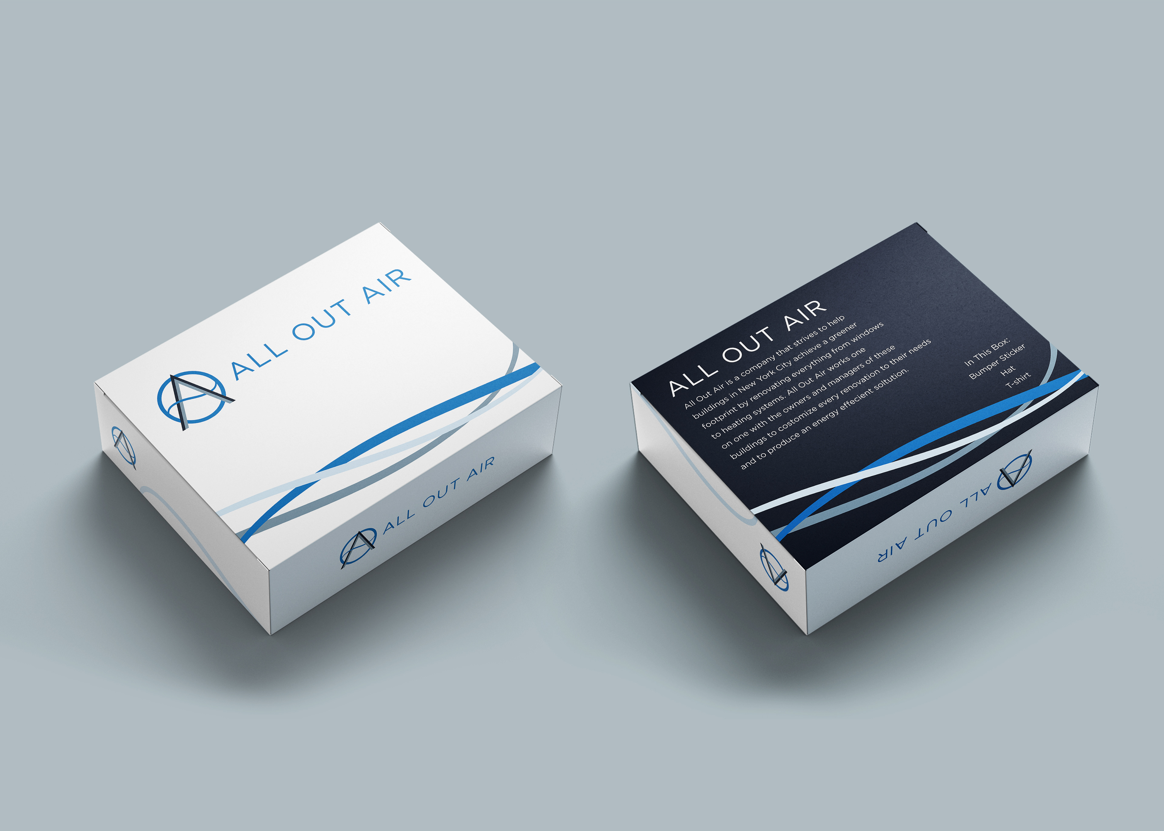
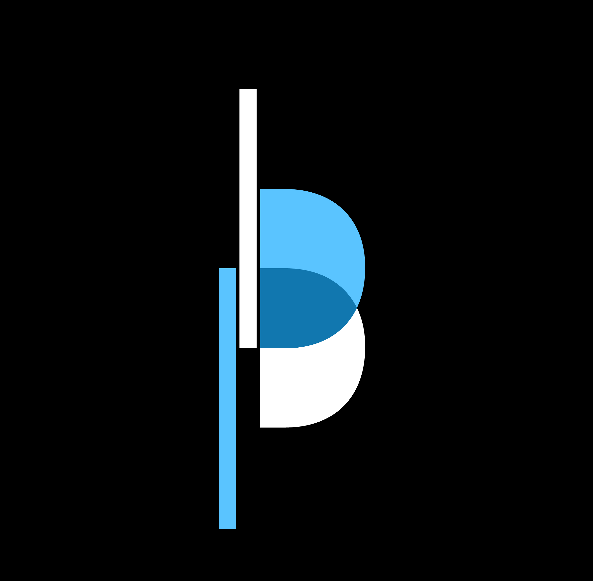
All Out Air is a fictional company which specializes in renovating large buildings to make them more energy efficient. I created a logo, stationery, business card, and packaging design. The thinking behind my design was to represent air flow and cleanliness which are ideas that represent the company.

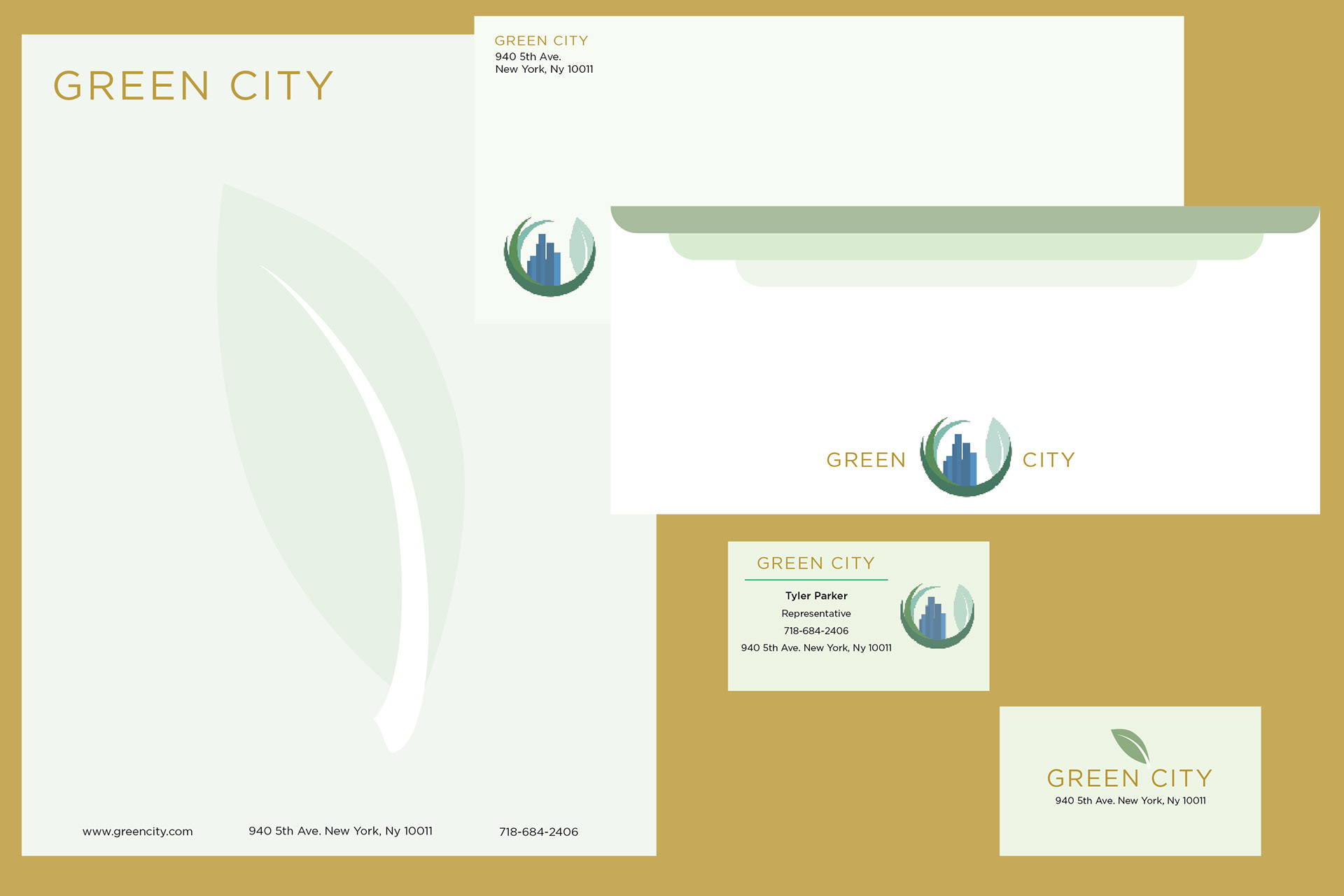

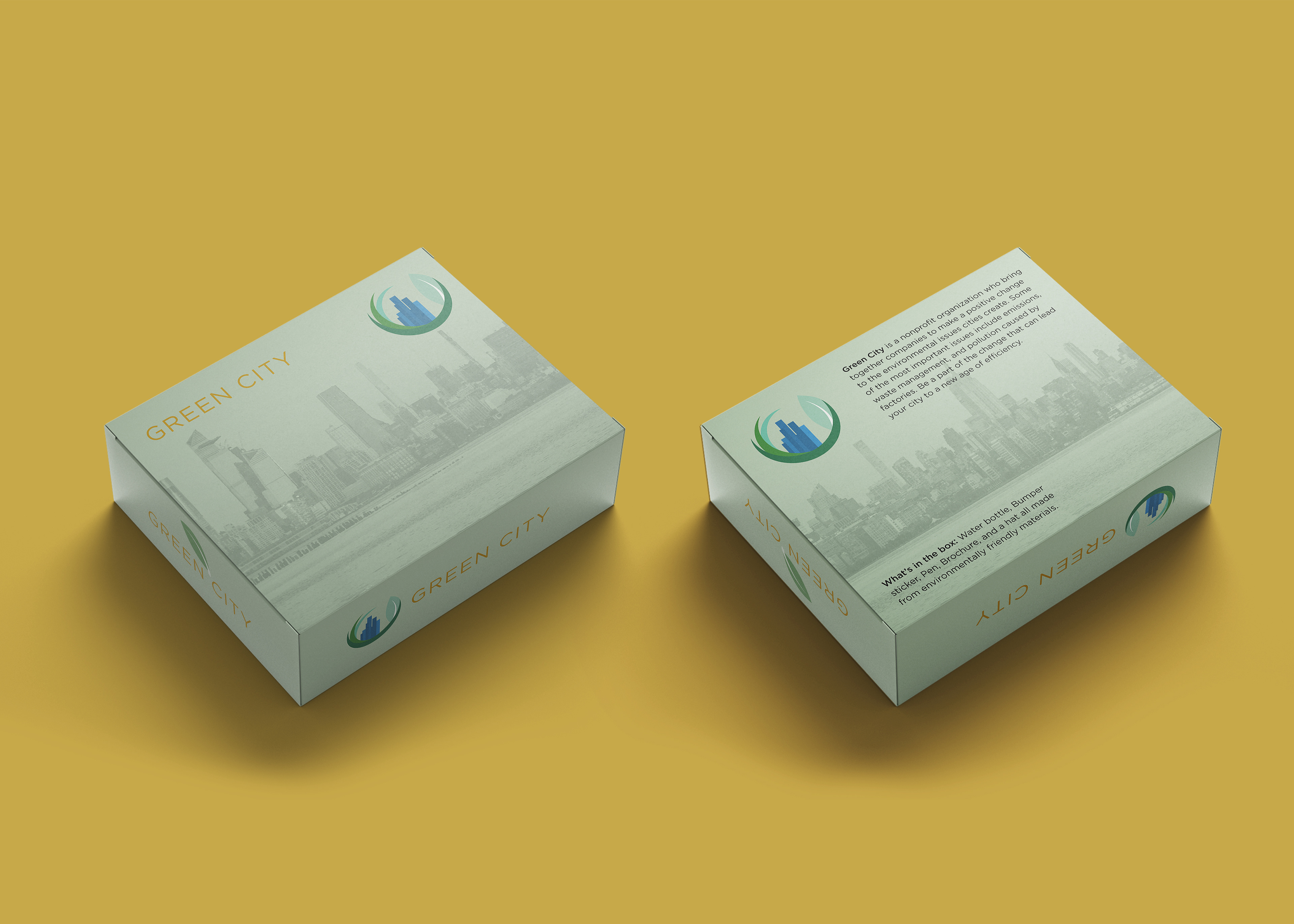
Green City is a nonprofit organization that brings together companies to make a positive change to the environmental issues that cities create. Some of the most important issues include emissions, waste management, and pollution caused by factories.